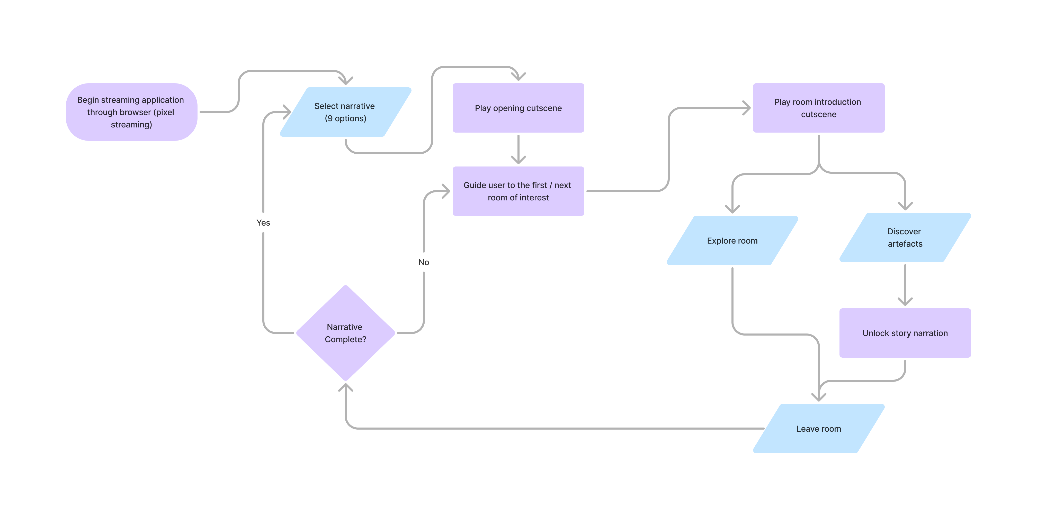
Basic user flow mapping the relationship between narrative sections, free exploration, and artifact discovery.
An interactive experience celebrating 50 years of Canada's National Arts Centre, letting visitors across the country step inside the building to explore its history, and discover it in ways even frequent visitors never have.
Toolkit
The brief
The National Arts Centre has stood at the centre of Canadian cultural life since 1969. To mark its 50th anniversary, the goal was to create an experience that would bring the NAC building and it's archives to all of Canada.
The brief set up two very different audiences with two very different needs: someone who had never set foot in the NAC should feel genuinely transported into the space, while someone who knew the building intimately should encounter something they'd never seen before. Designing for both simultaneously became one of the central creative and technical challenges of the project.
Those who had never been inside should feel like they're in the space. Frequent visitors should see something they've never seen before.
The question we were trying to answer
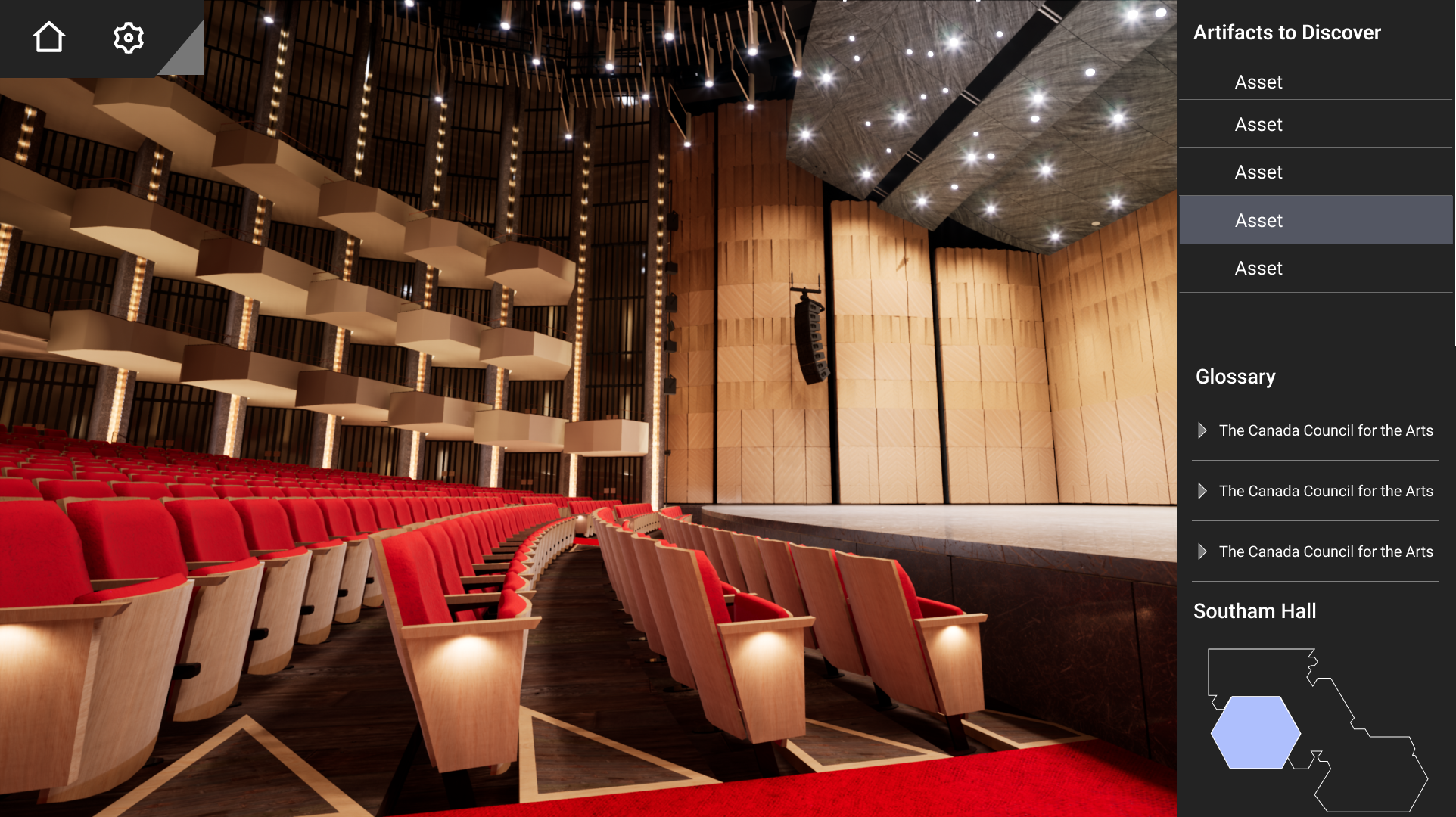
Early in the project it became clear that the UI would make or break the experience. The experience combined free exploration with guided narrative sections, with discoverable objects scattered throughout the spaces: objects and moments embedded throughout the space that users could find, examine, and learn from.
The interface needed a basic map, a room list, and an artifact inventory. The primary audience is not expected to be experienced in gaming, so it was important that the UI be simple and familiar; more reminiscent of a website than a game.
Basic user flow mapping the relationship between narrative sections, free exploration, and artifact discovery.
UI design
The first wireframing phase focused entirely on the main menu: the panel that would hold the artifact list, the map, and the room navigation. The core tension was density versus presence; the menu needed to hold a meaningful amount of information, but had to occupy as little screen space as possible to preserve the sense of being inside the building.
A key insight during this phase was that the menu's contents weren't equally useful at all times. During guided sections, where the camera follows a preset path, users have no rooms to search, meaning the map is useful but the artifact list is not. This led to a modular panel design where sections could be independently shown or hidden, rather than presenting everything at once.
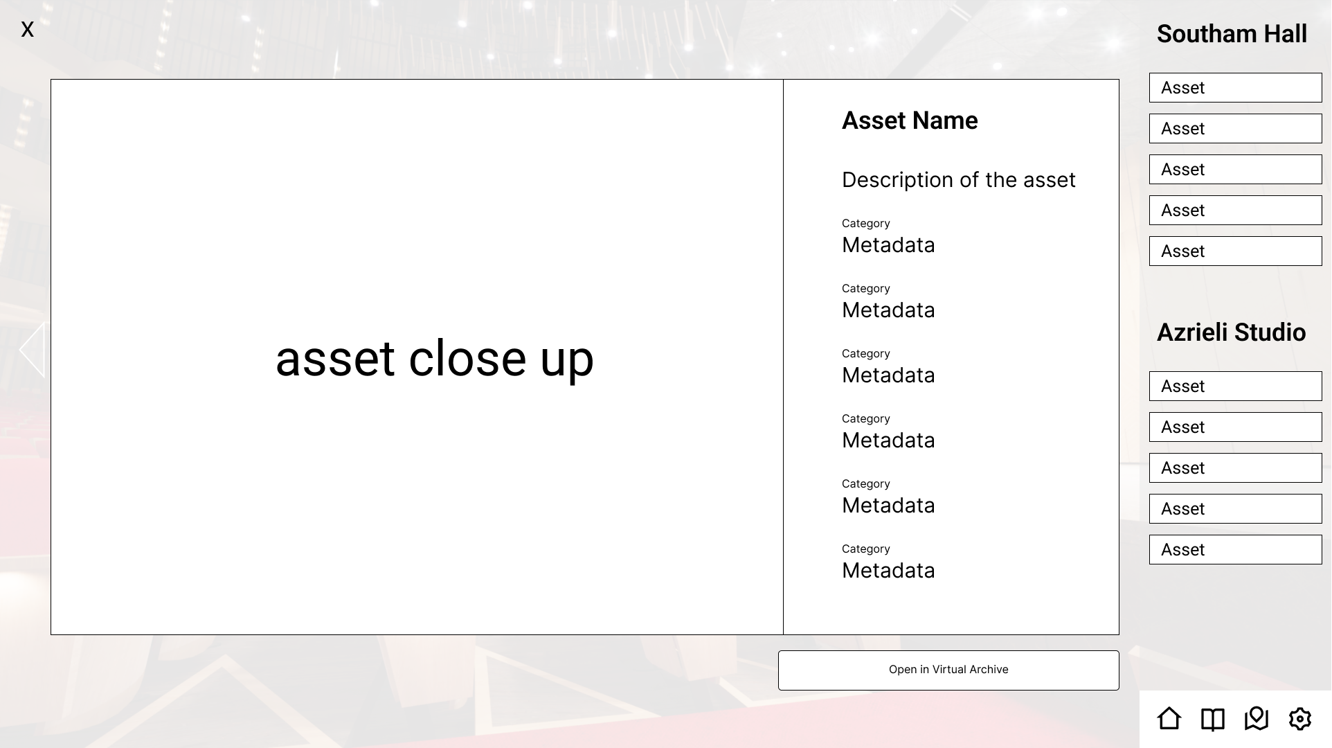
I also worked through how artifact discovery should be communicated. Clicking a discovered artifact in the list needed to surface more information, such as a close-up of the 3D model, image, or video, without navigating away from the environment entirely.
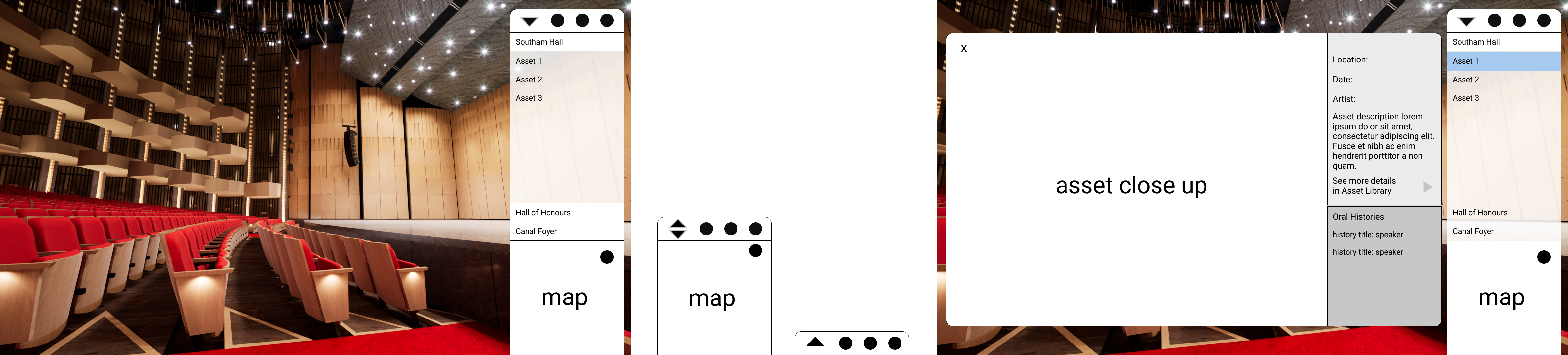
V1 wireframes for the experience.
V2 wireframes for the experience.
With the wireframe structure established, the first mockup pass introduced the NAC's brand colours and began working through the visual language of discovered versus undiscovered artifacts. The distinction needed to be immediately legible, without relying solely on colour, to remain accessible.
Early mockups of the main menu and map window
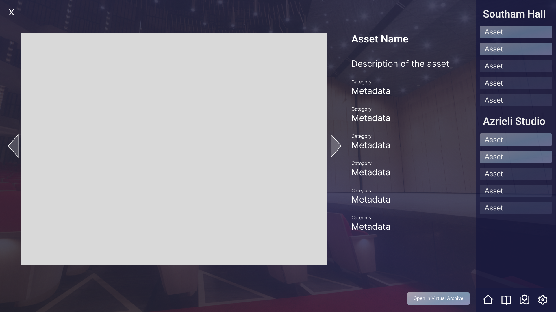
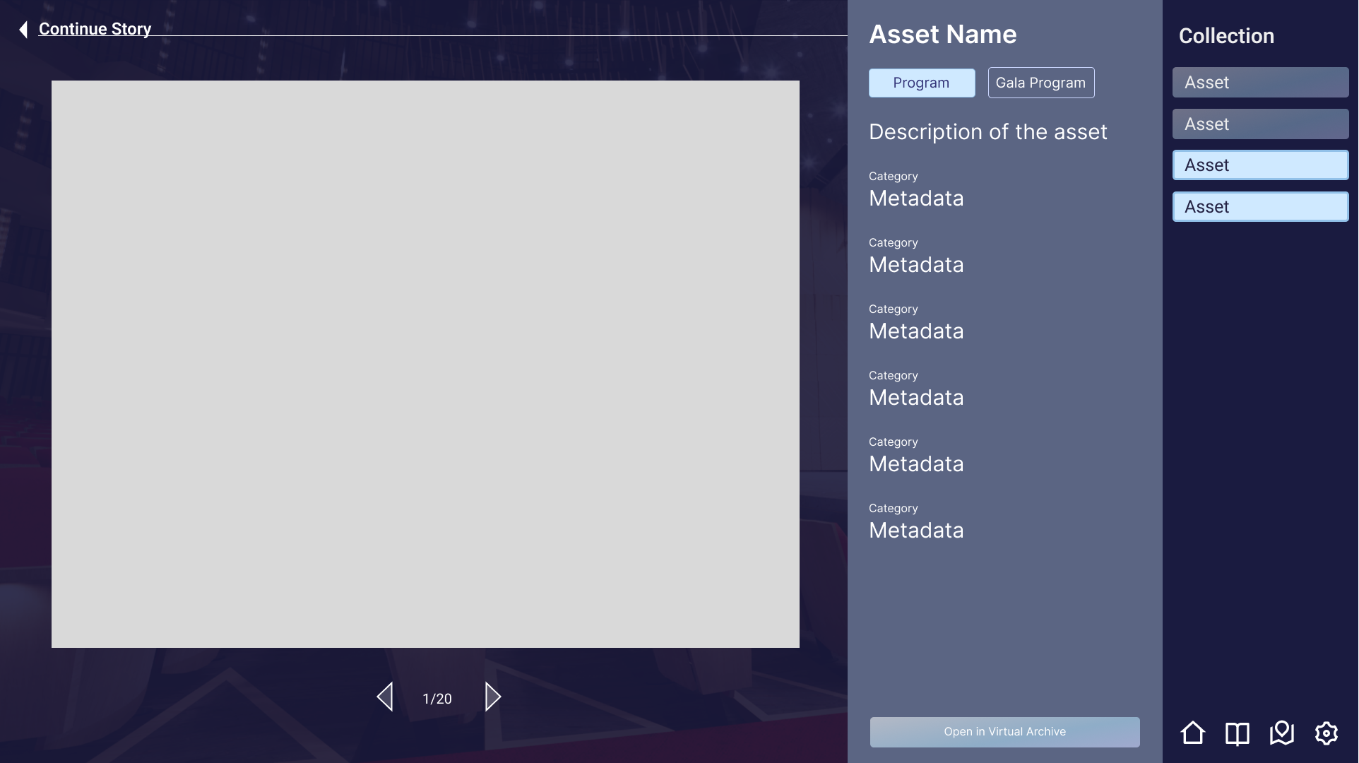
Early mockups of the asset close-up window
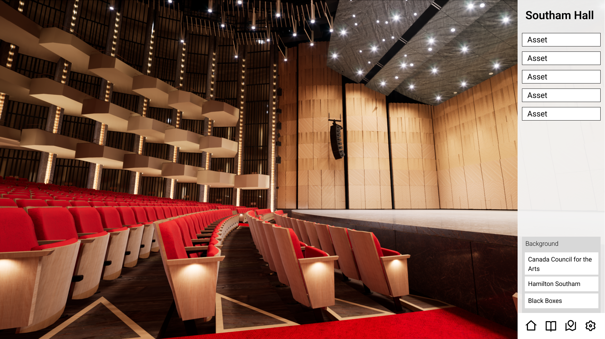
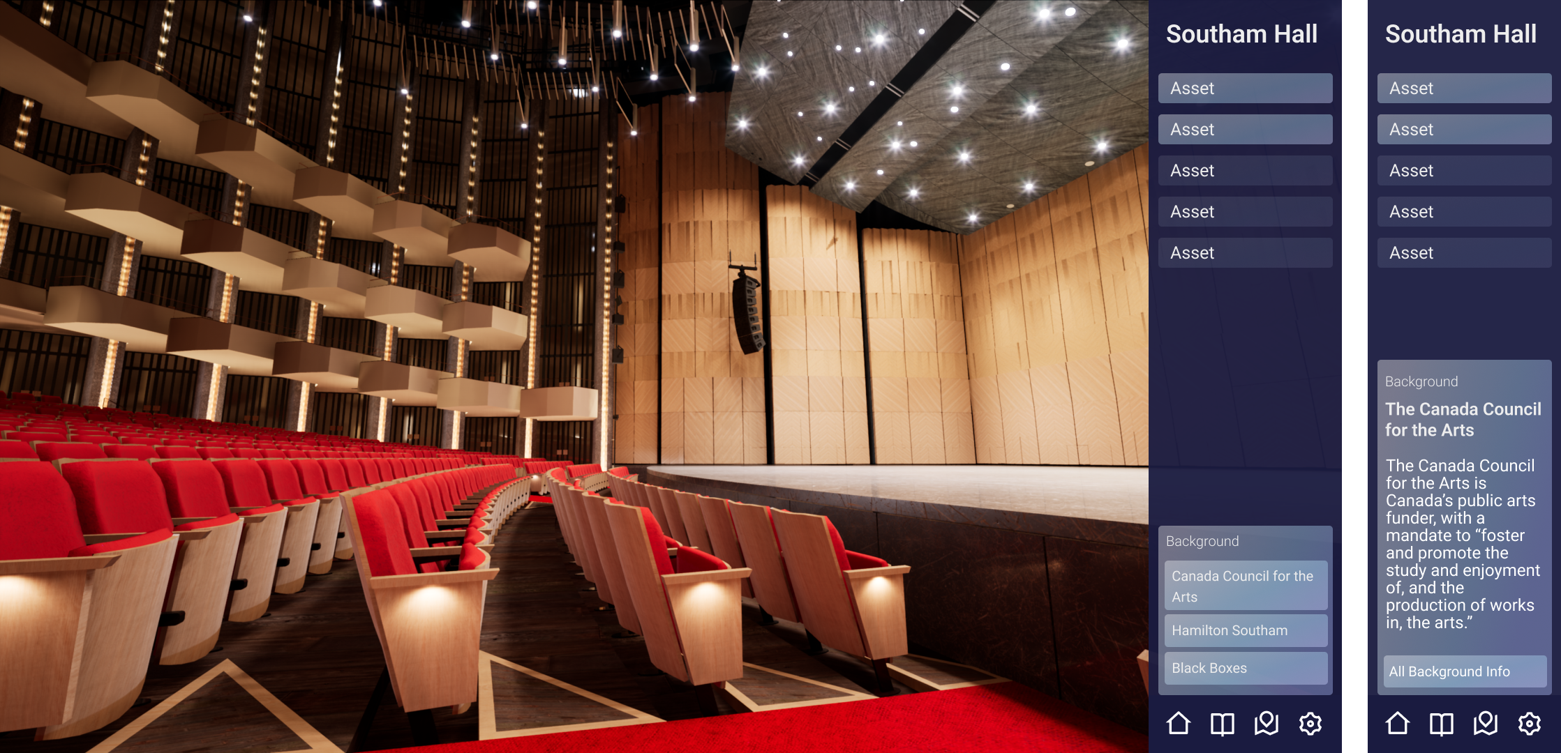
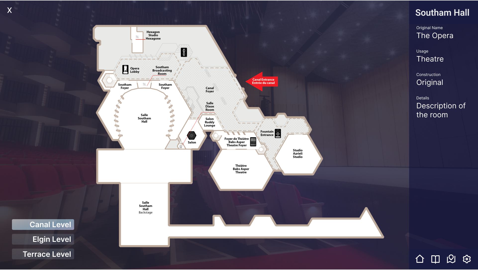
Feedback on the first iteration pointed toward the same issue from multiple directions: there was too much competing for attention. The final mockup pass made a series of focused reductions. The palette was simplified, with the brand purple pulled back to accent use only. The menu was widened to accommodate longer text chunks more comfortably. The fullscreen map was cut entirely in favour of a minimap only, as it was found that a larger map was not needed or desired. Non-narrative controls, home and settings, were moved to a quiet top-left position, clearly separated from the experience-facing interface.

Final UI designs: Simplified palette, application functions moved out of story menu and into hidden menu in the upper corner.
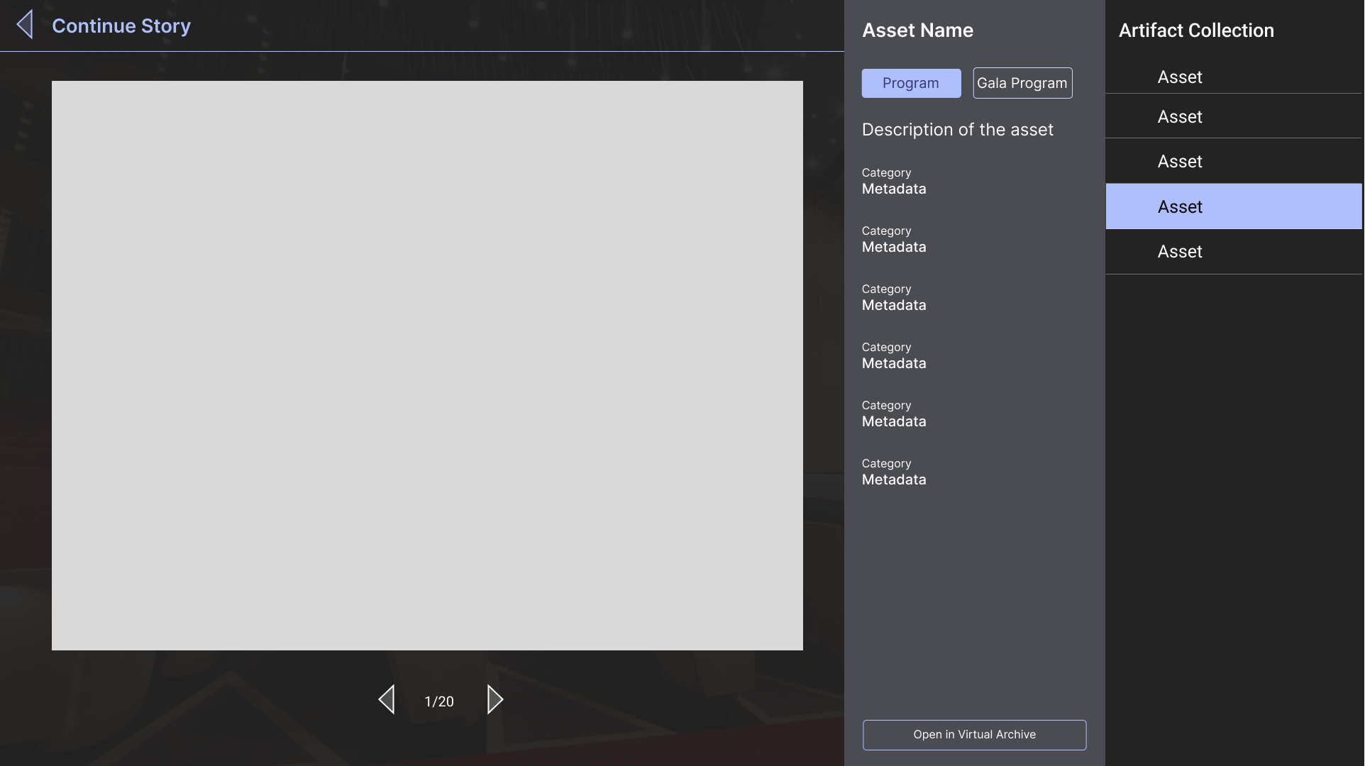
Final UI designs: Assets close-up window.
Unreal Engine development
Alongside the UI work, I was deeply involved in the Unreal Engine implementation, which meant the design decisions I made in Figma were ones I also had to execute in engine. That dual role shaped both disciplines: it kept the UI grounded in what was technically achievable in real time, and it meant implementation decisions were informed by the user experience intent from the start rather than being handed off across a gap.
Development work included implementing the user interface in Unreal's UMG system, building out the interactive features that drive artifact discovery and narrative progression, and contributing to the construction of the immersive environments users move through. The guided camera path system, which needed to feel cinematic while still honouring the user's ability to freely rotate and look around, was a particular area of focus, requiring careful tuning to feel navigable without feeling mechanical.
What it became
NAC@50+ is set to launch in 2026. The finished experience will allow people across Canada to move through the National Arts Centre, follow curated narrative paths through its history, and discover artifacts embedded throughout the building; each one a piece of the story of fifty years of Canadian cultural life. Images and video property of Carleton Immersive Media Studio.
What I learned
The most valuable thing about working across both design and development on this project was the feedback loop it created. Decisions that might have survived a handoff, such as a transition that felt smooth in prototype, or a panel size that worked in Figma, got pressure-tested the moment I had to implement them, often revealing something worth revisiting.
The biggest ongoing challenge was maintaining immersion as a non-negotiable constraint rather than a nice-to-have. It's easy for UI decisions to accumulate incrementally, each one small and justified in isolation, until the interface has quietly taken over the experience. Keeping that pressure visible, and being willing to cut features that didn't hold up against it, was something I had to actively defend throughout the project.