An online exhibition bringing Ottawa's history to life through artefacts, interactive storytelling, and a design that had to work seemlessly across museum tablets, visitor's devices, and desktop browsers.
Toolkit
The brief
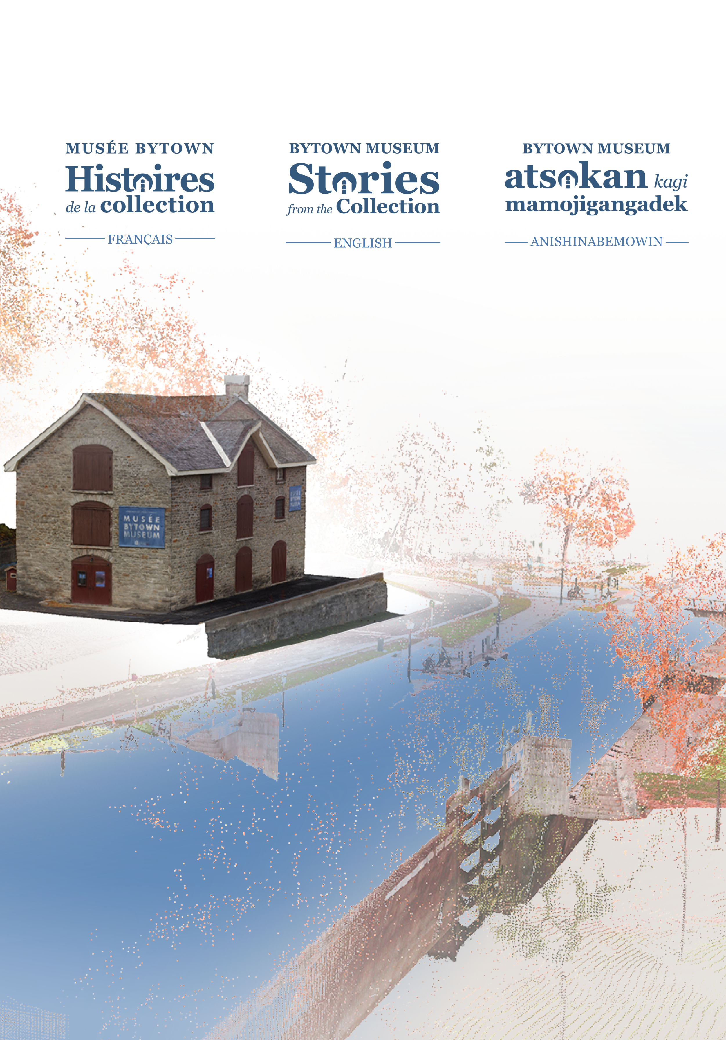
Stories from the Collection was a collaboration between Carleton Immersive Media Studio and the Bytown Museum. The goal was to create an online exhibition of artefacts from key moments in Ottawa's past, paired with an interactive storytelling layer that let users dive deeper into the origins of each object.
From the start, this was understood to be a project with two very different contexts of use. Someone might encounter the site from home, discovering it through a link or search. But visitors inside the museum would also be navigating to it mid-visit, either on their own phones or tablets provided by the museum, by scanning a QR code beside an installation.
Constraints and decisions
Rather than adapting a desktop layout downward, every page was designed mobile-first and then expanded. Tap targets, font sizes, and scroll depth were all evaluated for one-handed use in a standing context.
Visitors scanning a code beside a specific artefact would land directly on that artefact's page, not on the homepage. The artefact page had to be fully self-orienting, with no assumption that the user had seen the rest of the site.
The museum had an established visual identity that the site was required to honour. The design system had to extend those guidelines into a digital context while remaining accessible and functional across device sizes.
Project branding
The collection was organised around five thematic threads running through Ottawa's history. For the site to feel coherent rather than like a catalogue, each theme needed to be immediately and consistently identifiable.
I assigned each theme a dedicated colour and a custom icon, creating a visual shorthand that carried through every page of the site. A second set of five icons was developed for the other methods of sorting the collection, by era and by storage. This set would only be used for filtering assets, and would not be shown across the rest of the site.
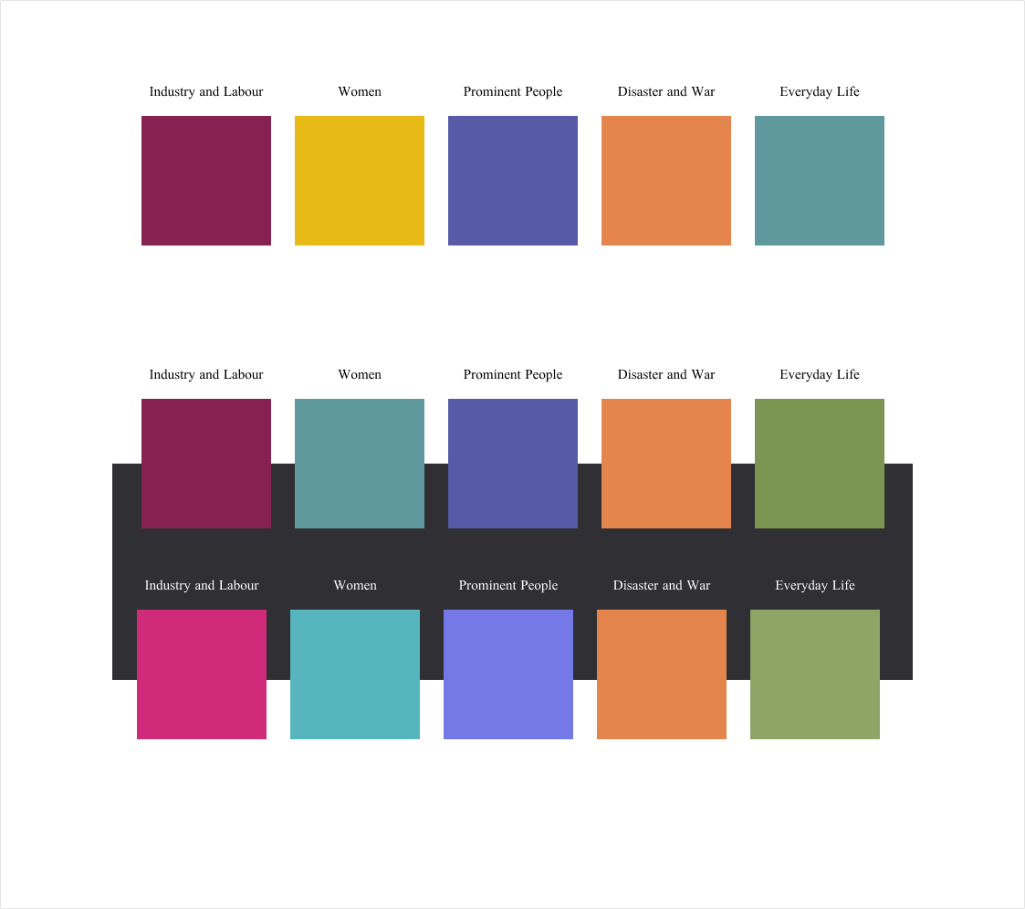
Colour palette and icons.
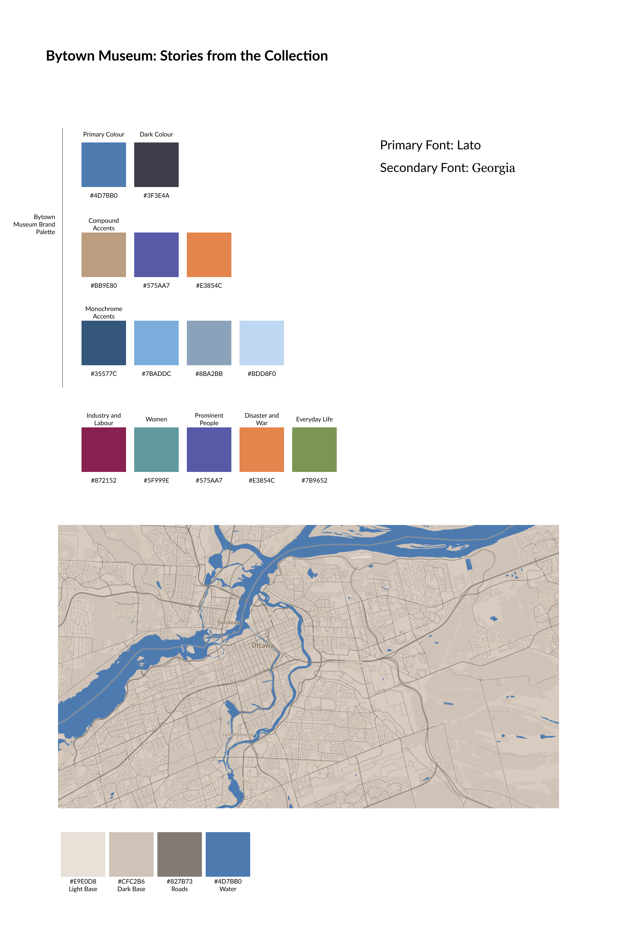
The brand accent colours were used in the final palette, with colours added as necessary to fill out the remaining themes.
Collections page
The collections page is the primary browsing surface of the site. Alongside displaying the available artefacts, the page introduces the five themes as active filters, allowing visitors to step into a curated view of the collection shaped around a specific narrative thread.
The filtering interaction was designed to feel curated; there are not so many artefacts that visitors would have to scroll far to find one in particular, so the filters offer different groupings of artefacts that may tell different stories. On mobile, the filter controls were kept accessible at the top of the page without requiring a separate drawer or modal, keeping the experience fast for visitors arriving with a specific theme already in mind.
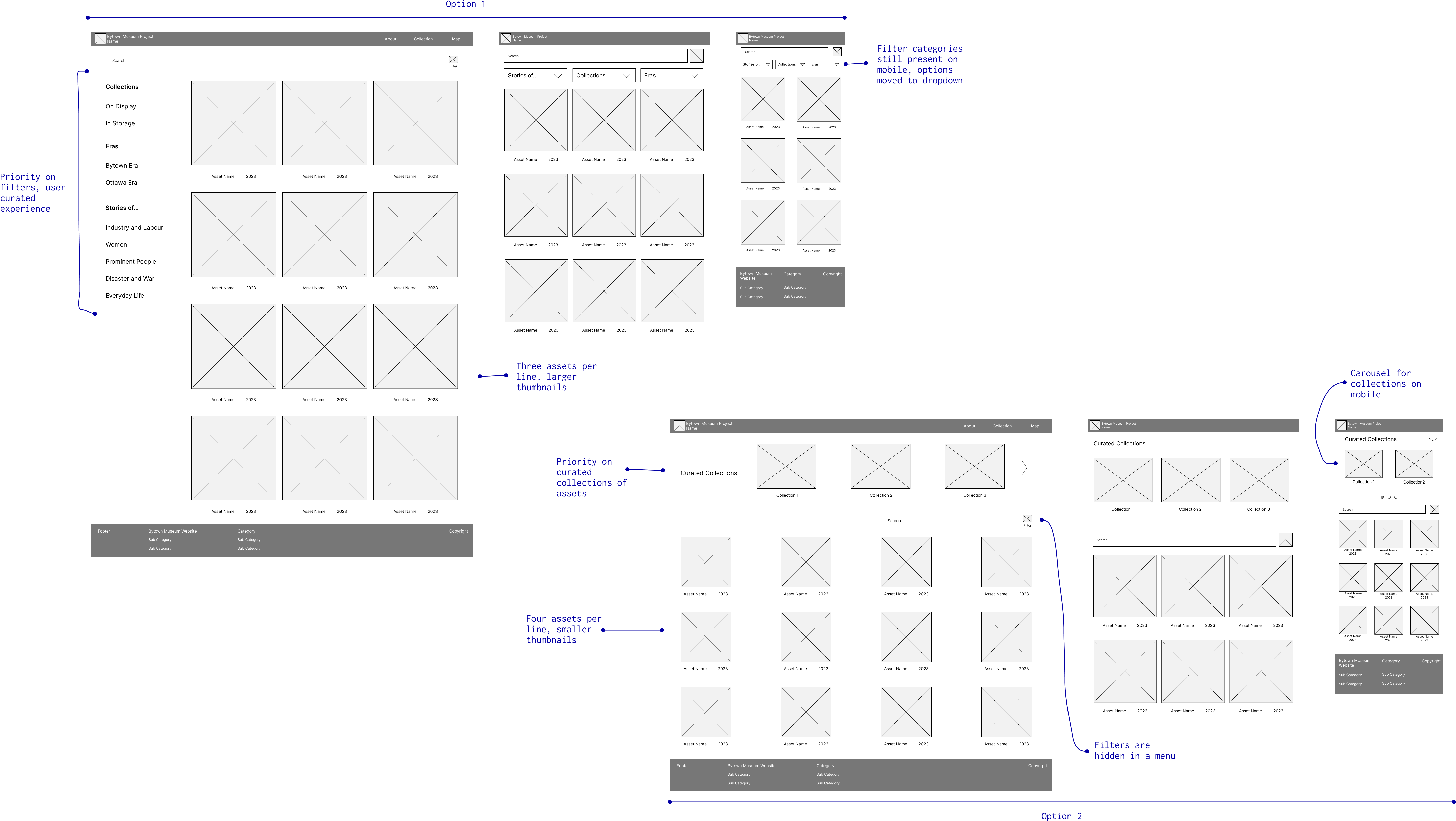
Collection: Initial wireframes.
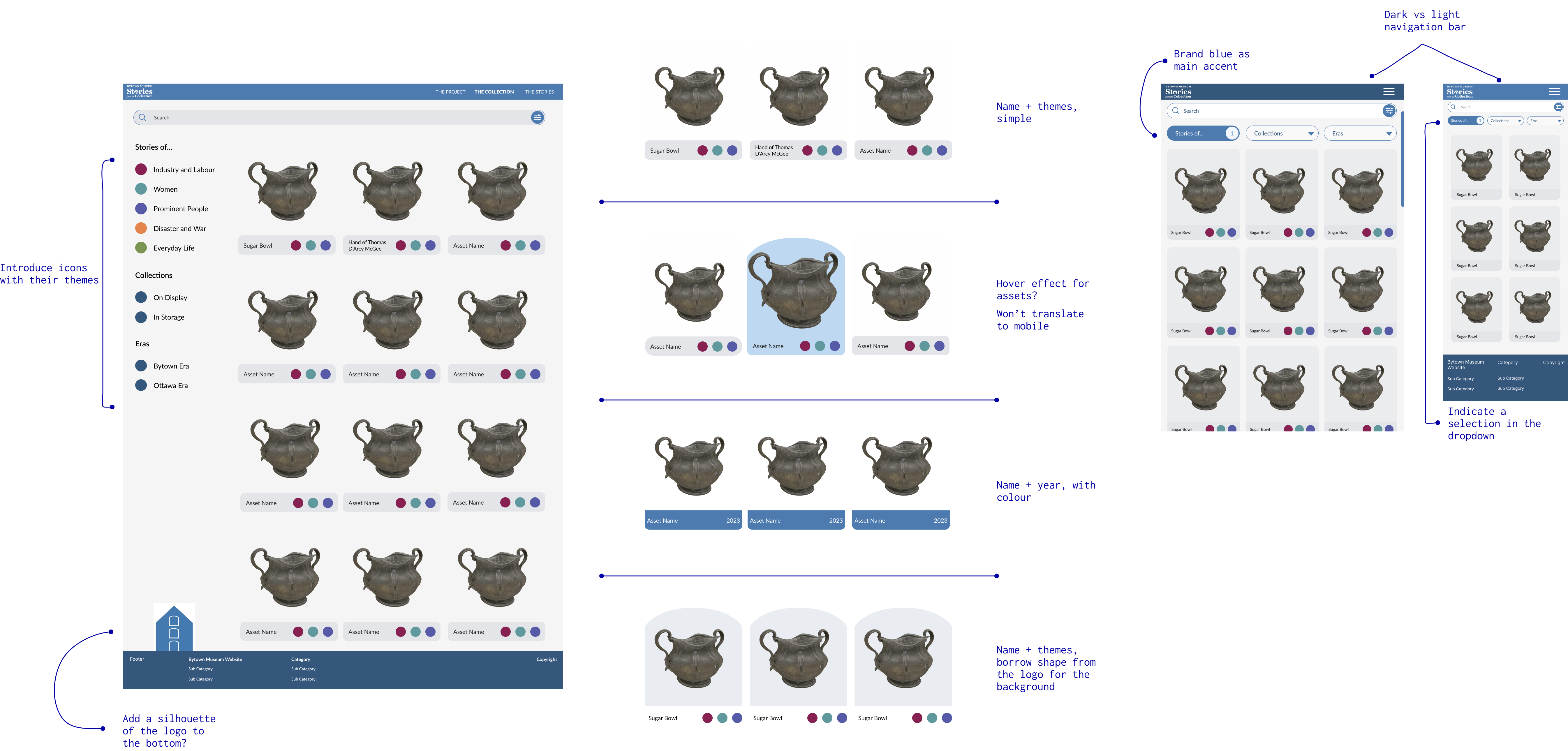
Collection: Mockups.
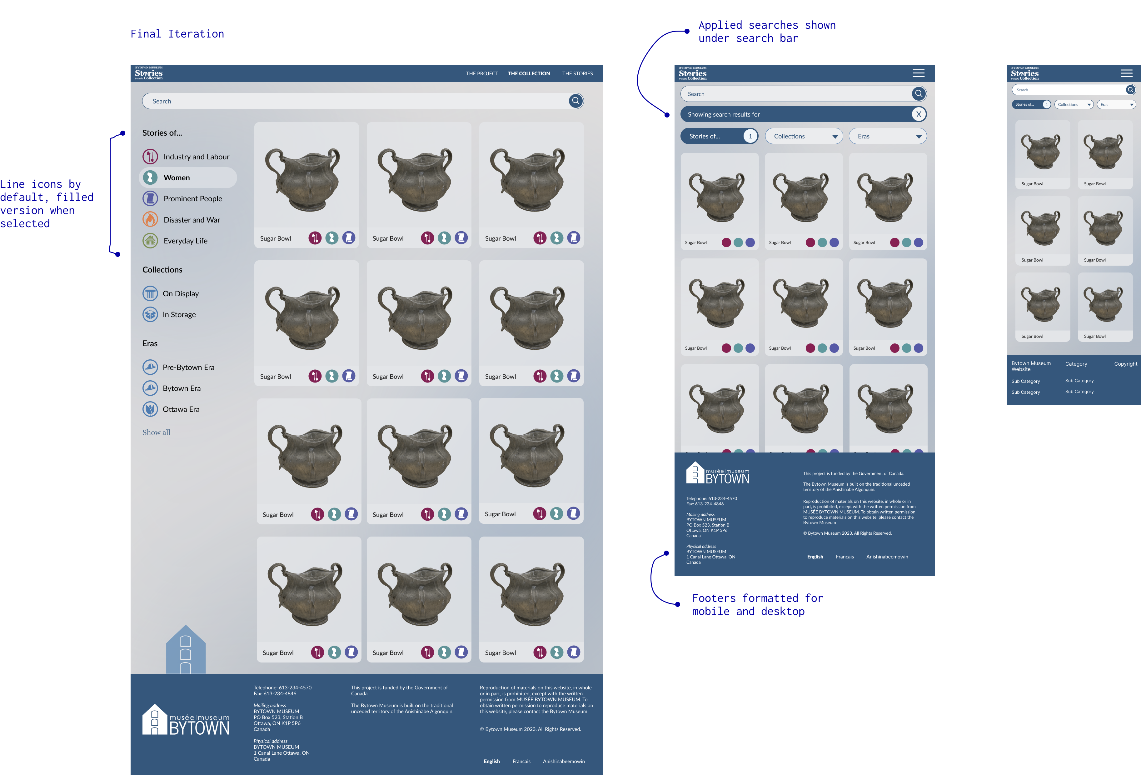
Collection: Final design.
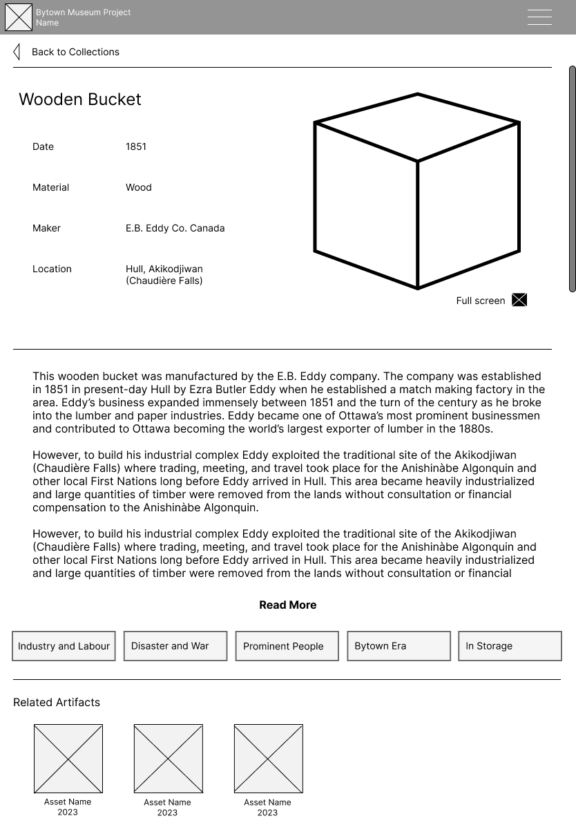
Artefact page
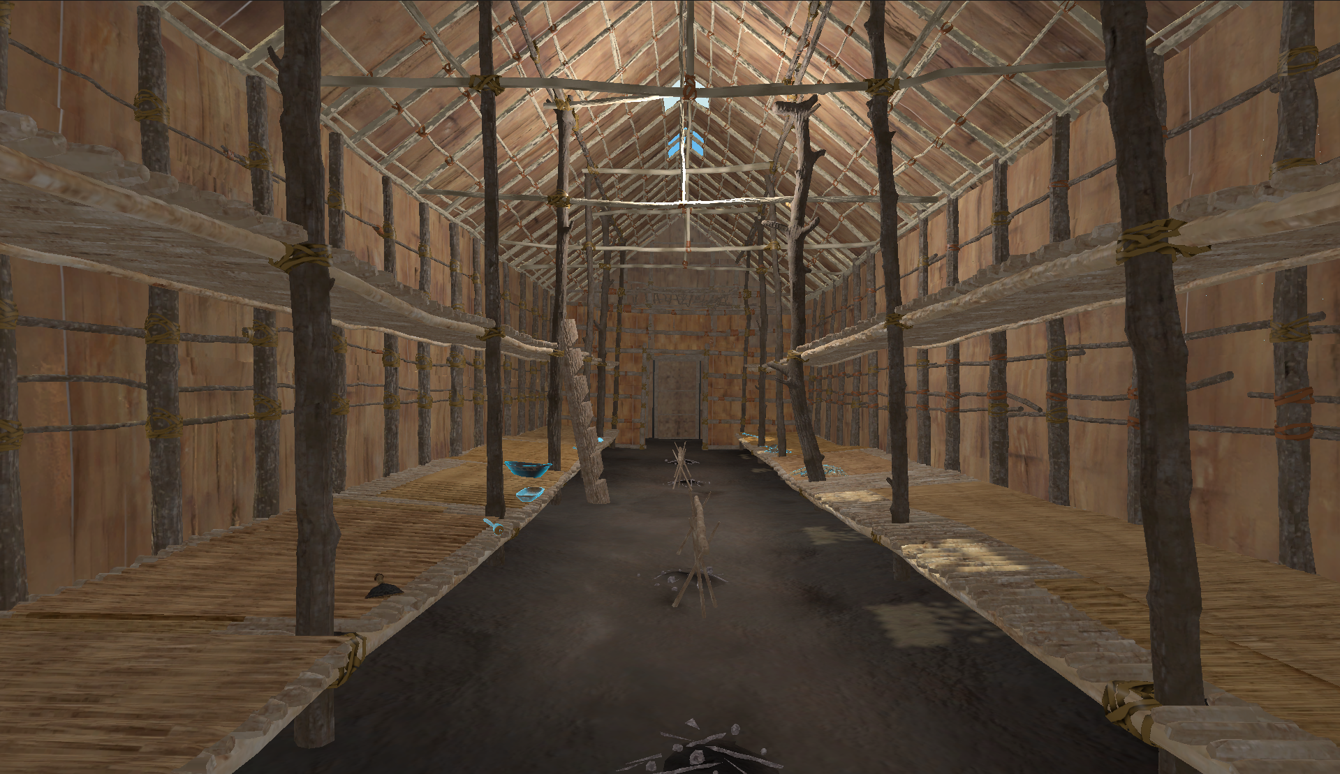
The artefact page is where a visitor learns about an individual object, engages with its story, and, for items on display in the museum, arrives directly via a QR code placed beside the physical installation.
The page needed to give the viewport for an interactive 3D model of the artefact as much room as possible, while ensuring that supporting content didn't require a long, effortful scroll to reach. On a tablet held vertically in a museum gallery, scroll depth is a real cost to the user. The challenge was making every element feel close, even on a small screen.
I worked through multiple layout configurations, testing how the 3D model viewport, artefact metadata, descriptive text, and media could be arranged without any one element dominating at the expense of another. The options below represent three of the more developed directions explored before arriving at the final approach.
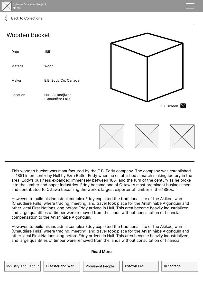
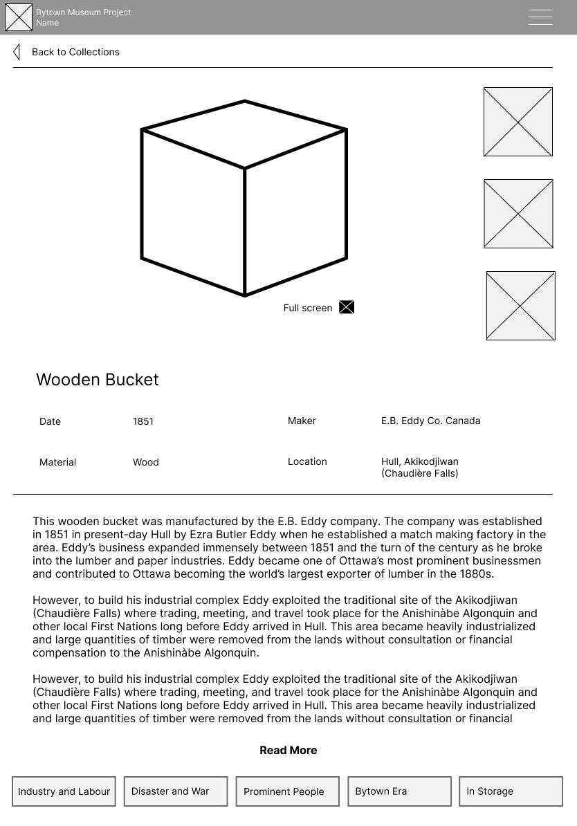
Three tablet layout explorations, each balancing the 3D model viewport against supporting content in different ways.
Constraints and decisions
Partway through the project, a planned feature was revised. The original artefact page had included a section linking to related artefacts, objects connected by theme or era, which would take the user to a new artefact page. As the collection requirements were refined, this was replaced with an image carousel of photographs relevant to the artefact, occupying the same viewport space as the 3D model.
This shift was beneficial for users and for the overall design: visitors got to see more content relating to an artefact, and the 3D model and the image carousel could share a single viewport through a toggle, keeping the page footprint compact and the interaction model consistent.
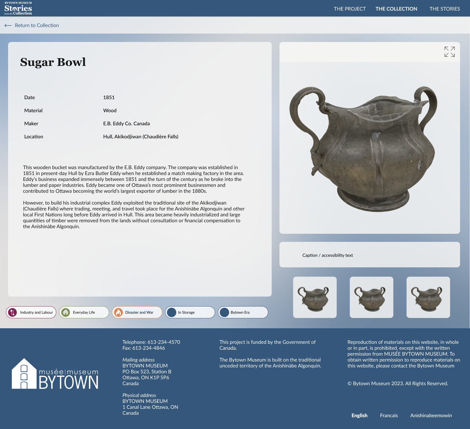
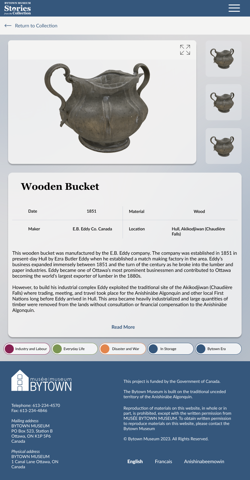
The final artefact page on desktop and tablet.
What it became
Stories from the Collection is live at bytownstories.ca, where visitors to the Bytown Museum and anyone curious about Ottawa's history can explore the collection, follow its thematic threads, and engage with artefacts through interactive 3D and archival photography. All images are property of Bytown Museum and Carleton Immersive Media Studio.
What I learned
The QR code use case sounds like a footnote but it was one of the most clarifying constraints I've worked with. It forced every layout decision to be evaluated against a context where the user is physically present in a space, holding a device with one hand, with something real in front of them competing for their attention. That's a very different bar than "does this look good on a phone."